This partial transcript of the App Fairy podcast has been edited for length and clarity. Visit appfairy.org for more information about Nosy Crow.
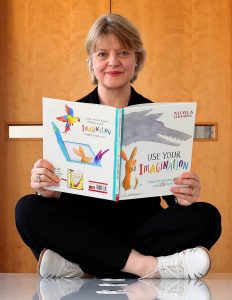
Carissa Christner: Hello and welcome to the App Fairy podcast. My name is Carissa Christner, and I’m a children’s librarian from Madison, Wisconsin. Each time that we have an App Fairy podcast, I interview a different app maker in a sort of meet-the-author format.
Today I’m very excited to introduce you to Kate Wilson, Managing Director of Nosy Crow.
Kate Wilson: Thank you so much for having me, it’s a real pleasure.
CC: So your offices are located in London. Can you tell us a little bit more about the area?
KW: So we are! We’re in a part of London called Southwark, which is quite near London Bridge.
CC: How did Nosy Crow get its start? Did you start out just with books or with apps?
KW: We started almost simultaneously with books and apps. Our first book came out in January 2011 and our first app came out in February 2011. We were a young company and from the beginning it was a good thing to have a digital component to what we were doing.
CC: Nice! Do you feel like the apps create a larger demand for the books, or do the books create a larger demand for the apps? How would you say the two are related?
KW: In some ways I don’t think they are terribly related, at least most of the time. What I feel very strongly now—and I didn’t feel this at the beginning, this was not Plan A—but what I feel very strongly now is that the way you tell stories on screen is, and should be, and must be, different from the way you tell stories on the page. I’ve watched too many children kind of jab disconsolately at a screen hoping something will happen when it’s really just a book that’s got some bells and whistles and that somebody has kind of forced onto a screen.
What we’re trying to think about is how to tell stories brilliantly on screen. That’s question one [for us]. And question two, how do we tell stories brilliantly on the page? I actually think I’m a better print publisher for young children now, having had a lot of digital experience, than I was before I started, because I think very hard about what the page can do—the printed page—versus what can the screen do—and how those are different.
Sometimes in the case of characters like Bizzy Bear or Pip and Posy, we’ve created apps that are not the same as books. We’ve tried to use characters that children may be familiar with in book form and bring them to the app screen, or characters children may be familiar with in app form and then make books available with those characters in them too.
CC: I’m really interested in this concept that you’re talking about, how a book really is very different when it’s on the screen versus when it’s on the page, because that’s something that I’m becoming much more aware of too as I really study book apps. Can you tell us a little bit about how that process has evolved for you, from the very first app that you guys did, The Three Little Pigs?
KW: The Three Little Pigs is one of the more linear story apps that we have. But even from the beginning, many of our current design principles still apply. We felt very strongly that reading must not be the most boring thing that a child could do on the screen. And we wanted there to be genuine interactivity.
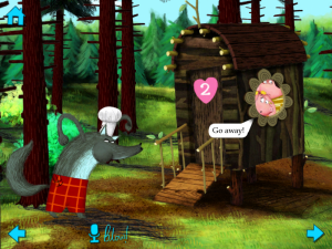
For example, in The Three Little Pigs, when the reader blows on the screen (and into the microphone), then they can help the wolf to blow the houses down. We think that children have really high expectations of what happens on screen. They expect it to be properly multimedia, so that means we’re also composing music that is very non-linear. When you compose or commission music for audiobooks, there’s a beginning, a middle, and an end, and you know how long it’s going to last. When you’re commissioning music for apps, you don’t know how long the child is going to spend on a particular scene. You have to have something that loops, but loops subtly.
There was a whole set of things we were thinking about in terms of multimedia and interactive expectations that children have of screens that informed our storytelling for fairy tales from the very beginning. I think you can see that in The Three Little Pigs, though in subsequent apps we’ve thought even harder about what it is possible to do with a screen that isn’t possible on the page.
CC: I think you guys have done a really groundbreaking job of exploring those different capabilities that a screen has. I love how in your version of Goldilocks and Little Bear, you’ve got Goldilocks’s point of view in one direction. But then if you flip the screen the other direction, it’s Little Bear’s point of view. I think that’s a fantastic use of the capabilities of the device itself.
KW: Yes! I mean, that just felt like something that you couldn’t do in a paper format. Another good example would be Little Red Riding Hood. When we were researching Little Red Riding Hood, one of the very early stories was from Provencal, France. In that story, Little Red Riding Hood meets a werewolf, not a wolf, but a bzou, which is the Provencal word for a werewolf. And the bzou in that version of the story says, “Will you take the path of the pins or the path of the needles?”
That prompted in our heads this idea of a branching path in the woods, creating almost like a choose-your-own adventure. So [in the app design] each choice that you make as Little Red at a fork in the path through the woods then affects how the story continues, and even how the story ends.
CC: I think that part is actually one of my favorites in all of your apps, where Little Red Riding Hood gets to choose which way she goes, and it actually affects the end of the book. I think that’s brilliant.
…
CC: Can you tell us a little bit about the artwork in the Nosy Crow apps? I know I’ve been focusing a lot on your fairy tale apps here, but they all have a very consistent style. Can you tell us a little bit about them?
KW: The fairy tale apps are drawn by Ed Bryan, who’s a brilliant illustrator with a background in game illustration. What I think is very reassuring for people who think that apps are kind of scary and cold and conclusory is that Ed starts with pencil sketches every time. He’s all about creating characters in the way that illustrators have created characters forever. He starts off with pencil sketches in a little sketchbook, and then he gets those onto the screen, and then he starts coloring them up on screen…
[After creating the individual characters] he creates the background images. Every single piece of foliage, every bush that he draws, every tree—he does all of those leaves on those trees individually. Then he puts those illustrations into a program called Maya, which helps him to construct a 3D tree. So if you tilt your iPad when you’re looking at our apps, you get a sense of their 3D quality. It’s a very long, complex process but I think it provides a very picture book-y feel, like in the Fairy Tale Play Theatre app, because I think his illustrations have a lot of love in them. A lot of illustrated love.
CC: I definitely get that feel from them and I think that concept of making them 3D makes them even richer. It’s like being able to look at a picture book, but look deeper into it in a really special way. Do you have a different artist for the Bizzy Bear apps, or the Pip and Posy apps?
 KW: Yes, the Bizzy Bear apps are created by the same person who creates the Bizzy Bear books, Benji Davies. So in that case, we have the book art and then we break it up. In the case of Bizzy Bear, we take the best full-frontal version of Bizzy Bear that we can have, where he’s standing looking at the reader, and we have to break him up and then almost animate him, like a puppet. Does that make sense?
Benji, who creates all the Bizzy Bear artwork, works digitally. So that’s a relatively easy thing to do. We can almost peel Bizzy Bear off the background because Benji, when he created Bizzy Bear, will have drawn the background and then he’d sort of placed Bizzy Bear digitally onto it. So then there’s something behind Bizzy Bear, there’s art behind Bizzy Bear.
By contrast, in Pip and Posy, there’s nothing behind Pip and there’s nothing behind Posy because Axel Scheffler, the illustrator behind Pip and Posy, he works in watercolor. So then it’s a much more complicated, difficult process to do any animation for Axel’s illustrations, which is quite a limitation in terms of what we can do with his art on screen [CC: Because his art doesn’t start digitally.] Right, because his art doesn’t start out digitally.
CC: Is there an average length of time it takes to develop an app from idea to available?
KW: We’ve discovered over time, with the size of the team that we have, that something as complicated as a fairy tale app takes about nine months from start to finish.
…
CC: One of the really important concepts that librarians and researchers are trying to share with parents when it comes to sharing apps with their kids is something that we call joint media engagement, which is really just a fancy way of saying play together with your kids as they’re playing with apps. Does the Nosy Crow team keep this concept in mind at all as they’re developing new apps? Have you heard of this concept? What are some of the ways that your apps do encourage people to play together?
KW: Yeah, we see a lot of parents reading the story with their child and then working through the app with the child. We know that happens, but I have to say that one of the things that we were interested in was actually giving children a kind of autonomy. Because I was struck by the fact that when my children were little, before they could decode text, they were very reliant on an adult being around, or knowing the text. They could work within known text very well, and then they’d be able to tell themselves the story.
I was quite excited about the idea that some reading time could be independent of an adult. Of course we also know that some parents will just sort of give their screen to their child, and the child is engaging with the app on their own. I feel comfortable that the quality of the app that we’re producing means that can still be screen time well spent, if you like.
With all of our apps, we have the option to have it read to you or to read it myself. And again that’s a mode that would encourage a parent and a child to interact with the app. We’re not expecting that parents would use one mode exclusively or the other mode exclusively. We think a lot of parents are trying it out, changing between familiarizing the child with the app by providing an audio version of it, listening to the audio version, and then they’ll explore and they’ll retell the story themselves. I think that’s a factor.
And we’ve also included gentle tools to encourage children to read it themselves as much as we can. We’ve done highlighted text in the audio version, so that you can see the words come up. And in the case of the read-it-by-myself version, you can choose different lengths of time for which the text appears. So you can choose a short length of time, a medium length of time, or a long length of time. So again, encouraging children to approach this in as many different ways as possible.

I think the app we’ve made that most clearly encourages sharing and engagement is the Fairy Tale Theater, where we really are encouraging children to make films of theater puppet shows that they are doing and then exporting those puppet shows. And we think that’s very exciting.
Handing back that creative charge is one thing I think that’s really thrilling. And enabling kids to capture that and then send it to whoever they want to is terrific. We’re very aware though of being responsible as app creators. One of the things that we wanted, one of the things that interests me about apps, was this potential for online play and the degree to which an app is a kind of walled garden.
We want to be quite careful about how many links to the “outside” any given app has. We’re very careful about introducing things that either pull the world in, or push the child out of the app [like social media sharing] and outside of the walled garden. I think there’s something very safe about the rules of the app if you like.
…
KW: One of the things I think has been surprising to us, just as a little footnote, are two things librarians have said to us here in the UK. One is how much they’re using the apps for children with special education needs. We have some fantastic stuff on it, a really beautiful piece written by the mother of a child called Ines on our web site. Ines adores our fairy tale apps, and they’ve been an immense part of her education and understanding a story, and Ines is a child who has down syndrome. We can’t begin to pretend that we created the app for children who have special educational needs, but I’m very interested that the apps have been particularly useful to a community of parents and carers and teachers and librarians who are supporting children with special education needs. So I think that’s fascinating.
The other thing that librarians have talked about has been the audio, and how useful the apps are for people for whom English is not the home language. [We’ve heard that] parents feel very comfortable and supported sharing these stories with their children because they have audio language support.
CC: That is absolutely one of the benefits of having these books with the narration available. But I do appreciate that you have both read-to-me and read-it-myself options. If there’s an app that only has the narrator reading it and doesn’t even have an option to turn that off, that’s almost a deal breaker for me. So I really appreciate that you guys have included that as an option—because it’s true that the apps will be used in different ways and it’s nice to be able to choose which way you’re going to use it.


