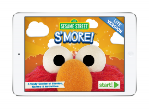
 This past spring, our colleagues at Sesame Workshop Publishing launched S’More, a new online magazine for kids 2-5 that is a more interactive experience than a traditional “magazine.” We invited them to share the process with us in a two-part series that looks at the research that informed their publishing decisions here, and next week, a look at the production process.
Content Development
by Betsy Loredo, Executive Editor & Producer, Sesame Workshop Publishing:
What experience does the word “magazine” define for readers, especially children, today? Just as the world of “grown-up” print is transforming to meet changes in technology and consumer behaviors, Sesame Workshop Publishing must adapt in the same way and re-evaluate our definitions of long-familiar terms, as we create a digital magazine for our audience of families of preschoolers.
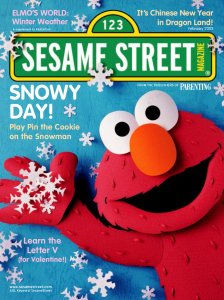
Sesame Street Magazine had a long and prestigious history at Sesame Workshop – premiering in 1970, just a year after the TV show debuted. The magazine remained in print, a vigorous extension of the screen experience, until 2002, when the stand-alone issues became an insert in issues of Parenting magazine. After a few years, that licensing relationship ended, and the magazine faded away altogether in 2011.
Much vibrant and still-relevant material existed from those 41 years of magazine content development…was there no way to rejuvenate the magazine that generations of kids had loved? It seemed unlikely at first, at a time when print magazines everywhere, for children and adults, were struggling for their very existence against the competition of digital offerings.
So we began to consider the idea of creating a digital magazine, an app built entirely in-house, adapting existing magazine and other print assets to the new digital arena. This would allow us to be economical in a challenging financial environment, and, just as critically, it would enable us to be highly experimental—to continually test the success, appeal, and learning potential of that interactivity among magazine readers and revise new issues to reflect those audience-based findings.
And so began a two-year deep exploration of the digital magazine environment for kids and experimental app builds of our own. We were aiming for a true transformation of the print experience, where touch and audio would be utilized in ways that a child’s eye and crayon had been used in the old print editions.
A small team of four was formed from the staff of the Publishing Department, which worked closely with the Workshop’s Education & Research team. Together, we developed a prototype – six pages of fully interactive content distributed as a live tablet app to 307 families with children between the ages of 2-5. The test included a week of unsupervised in-home testing and a follow-up survey.
At the time of testing in fall 2012, already 83% of those parents surveyed stated that they used their iPad every day, and 96% reported that their children had experience on the device, with 57% using it by themselves, independent of parent assistance. The majority stated that 10 – 15 minutes was the most time a child would or should spend in a single app in a single visit.
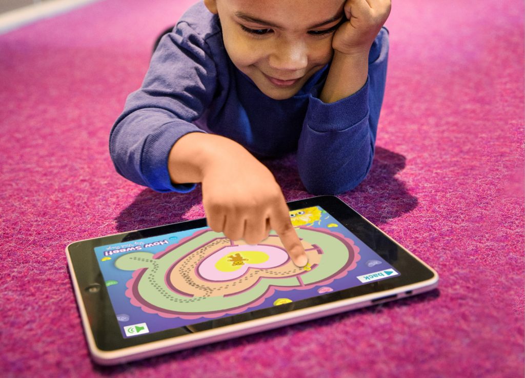
The family study made it clear the time was right for a digital magazine. Parents said the prototype provided an entertaining learning experience. Surprisingly, parents indicated no preference for the old magazine standard of 24 or more pages; instead, they preferred a smaller set of deeply interactive activities. The study also identified specifically what kinds of experiences parents and kids liked best: read-aloud stories, yes, but also art-related activities like coloring and stickers, plus matching and maze games. It also provided a window into how parents thought they wanted the magazine delivered: a collective set of issues delivered inside a single magazine “shell” was preferred to issues purchased individually as stand-alone apps, which added to screen clutter.
And so, Sesame Street’s very first digital magazine was born! After the research, we began active development. Content discussions paralleled business strategy (tablet or phone or both? which distributors? how many issues a year? pricing? develop in-house or with an outside partner?), and about 18 months after the prototype test, Sesame Street S’More launched in March 2014.
Each issue is a rich and fully interactive experience, informed by the Workshop’s 45-years-young “whole child” curriculum. Narrated by one of the show’s human characters and a child voice, all text on screen is spoken, and there are also additional audio prompts and encouraging phrases. Most of each issue’s ten activities include multi-tiered experiences to address the wide spectrum of skills reflected in 2- to 5-year-olds: completing actions unlocks new page levels, badges, and shortcuts. Activities include mazes; puzzles; coloring pages; sticker pages; stories; simple kid-friendly animations; and short, simply animated video…and the all-important character voices. Every issue focuses on a letter and a number and includes parent tips to extend the learning beyond the screen. As with all Sesame Workshop apps, the magazine includes embedded user analytics, allowing us to measure engagement and to extrapolate data about not only appeal but skill-leveling and learning, based on completion rates and badge achievement.
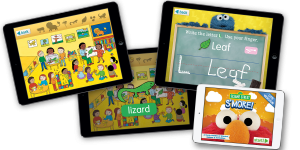
Just before launch came the final hurdle: a name. Once again we had to re-examine the meaning of the word “magazine.” This wasn’t the same Sesame Street Magazine any more. In fact, after a hiatus of several years, we now have two print magazines in the marketplace as well, so how could we let people know this was something new, something different, something more than the print version they’d known in the past? Sesame Street S’More became the clear winner in informal polling compared to many other options. In the parlance of Sesame’s healthy-habits initiative, it implied a fun “sometimes” treat that you didn’t indulge in every day because it was so special. The perfect name for a bi-monthly magazine.
We are now three issues into this new definition of a children’s magazine – hitting quintessential Sesame Street themes of love & friendship, ABCs, and neighborhood, with animals, manners, and Elmo’s birthday issues in the pipeline. We are learning more with each wave of analytics and each new concept and interaction that we tackle. It’s a constant experiment, filled with compromise, adaptation, creative problem-solving, teamwork…many of the skills we support on the show and in the magazine itself.
Now the magazine has to find its audience in an intensely crowded field and newsstand marketplace, where parents might not be looking for preschool content. Is there a home for a digital version of a kids’ magazine in this world of tomorrow? We hope that Sesame Street S’More will help to answer that question and define what the very word “magazine” means in the dawn of this digital age.
![]() You can find Sesame Street S’More here: https://itunes.apple.com/us/app/sesame-street-smore!-digital/id797795128?mt=8
You can find Sesame Street S’More here: https://itunes.apple.com/us/app/sesame-street-smore!-digital/id797795128?mt=8
Come back next week for a peek into the technical development process!
 Betsy Loredo is Executive Editor and an app producer of books and digital experiences involving the Sesame Street characters. She joined Sesame Workshop in 1990 and, in the course of more than two decades with the company, has worked on a wide range of Workshop properties: The Electric Company, Sagwa, Ghostwriter, and Square One. In 2009, she co-wrote and edited Sesame Street – A Celebration, the definitive illustrated history of the show, spanning forty years.
