Nosy Crow turned five years old in January. We published our first print books and apps in early 2011. The timing turned out to be quite significant in relation to our early ambitions for apps.

As a publisher, we are all about reading for pleasure, no matter what the platform or medium. From the very beginning, we knew that we wanted to make apps. And launching when we did meant several things. It meant that we came into being at around the same time as the iPad, when for the first time, there was an incredible opportunity to create children’s digital reading experiences for a mass market—stories that could reach a truly global audience. It meant that we could build a publishing company with all of the necessary skills to make apps ourselves, exactly as we imagined them, rather than having to outsource the work to a digital agency. And because we were a new company, it meant that we didn’t have a backlist. So, rather than trying to turn existing print books into apps, we seized the opportunity to tell stories that were designed specifically for an iPad, and that could take full advantage of all of the incredible technological potential of the device.
 Using hardware features like the iPad’s front-facing camera and microphone, the multi-touch touchscreen, and its accelerometer and gyroscope have been incredibly important to the way we develop apps, but not as a means of tacking interactivity onto a story as an afterthought or an embellishment. We don’t ever want technology to distract or detract from a story. It’s important to us because we know that children using an iPad (rightly) have incredibly high expectations of interactivity, and we don’t want to ever disappoint those expectations. We don’t want reading to be the most “boring” thing to do on an iPad. We try to use technology in ways that will enhance a story—ways in which interactivity will be integral to a narrative.
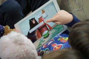
We have just released our 18th app, Goldilocks and Little Bear. We wanted to create something that would really celebrate the potential of digital storytelling for children, and I think that this app embodies the kind of story that can only be told and experienced on a touchscreen device.
Goldilocks and Little Bear tells the traditional fairytale story of Goldilocks, but with a twist. At any point in the narrative, you can flip your iPad and experience a second story taking place in parallel: that of Little Bear. While Goldilocks is in the three bears’ house, eating their porridge, sitting in their chairs, and sleeping in their beds, Little Bear is in Goldilocks’s family’s house, eating their pancakes, wearing their clothes, and reading their books. You can enjoy each story in parallel, individually, or however you’d like—the app allows you to toggle between the two at any point.
As a narrative device, this felt like a very natural, child-friendly mechanism that would be easy to use and understand. The primary audience for Goldilocks and Little Bear is 4–8 year-olds, and the customer feedback that we’ve received since launch suggests that this is a level of interactivity and technical sophistication that’s right for this age group. Just as importantly, it felt like something that would enrich the reading and storytelling experience: the idea of seeing what’s happening elsewhere in the story, off the page, is a really potent one. We design our apps so that they can be enjoyed by a child on their own, or as a shared experience with an adult (there are, for instance, “Read and play” and “Read by myself” options in all of our fairytales), and this mechanism also provided a great opportunity for shared and turn-based reading—by, for example, choosing together whether to stay with the same story or flip for the other story after each scene, or taking turns to pick a story.
Within each story there are lots of different forms of interactivity, too. You can play hide-and-seek with the bears, collect berries in the forest with Goldilocks’s family, help Little Bear try on Goldilocks’s clothes, see yourself in the bedroom using an iPad’s front-facing camera, tilt your device to rock Goldilocks on Little Bear’s chair, try each bowl of porridge and plate of pancakes, and more. And as with all of our apps, there’s an emphasis on reading for pleasure: every scene contains a chunk of narrative text—the “core” part of the story—that can’t be interrupted by any of the forms of interactivity, and in addition, there are hundreds of lines of additional dialogue (voiced by child actors) which can be triggered by touching characters.
I think this app demonstrates a form of storytelling that truly breaks away from the page: we simply couldn’t have told the story in this way in a print format.
 Tom Bonnick is Nosy Crow’s Business Development Manager and Commissioning Editor. He works on all of the company’s digital publishing, including its highly-acclaimed program of apps and the innovative Stories Aloud project, and also commissions fiction for the Nosy Crow list.


