Researchers and practitioners have long known that when it comes to digital media for kids, quality is key. But what does it mean for a children’s app to be good or bad? How do specific features and design decisions affect the children who engage with them? If parents want to find high-quality content, what exactly should they be looking for?
As part of a team of collaborators at Microsoft Research, the University of Michigan, and the University of Washington, I have been working to find out. In one study, we wanted to understand exactly what happens when kids and parents play with toys together—and what happens when those toys are replaced by screens. By taking a close look at how children and parents respond to specific components of their favorite apps, and comparing these responses to their play behaviors with other toys, we hoped to better understand how specific types of apps shape young children’s play.
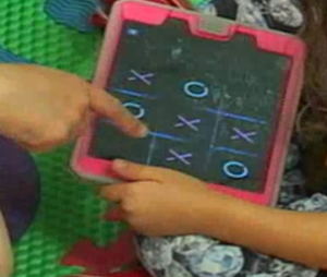 We set up a play room in one of our labs and filled it with ordinary toys—things like Legos, crayons and paper, dolls, books, and board games. We asked preschoolers between the ages of 4 and 6 to hang out in the lab with their parent, and we watched what they did. We also asked these same families to play in the lab again, but this time with their favorite tablet games instead of toys.
What changed? Well, quite a bit. When only toys were available, children were more likely to engage their parents in conversation, and they were more likely to reply when their parents spoke to them. With toys as stimuli, parents and kids spent more time building on each other’s ideas, paying attention to the same thing, and engaging in experiences together. When we gave kids a tablet, they were more likely to play on their own, trail off in the middle of a sentence, and ignore comments from their parent. Once the child had a tablet, the parent was less likely to give input or participate in play, and more likely to look bored or wander away.
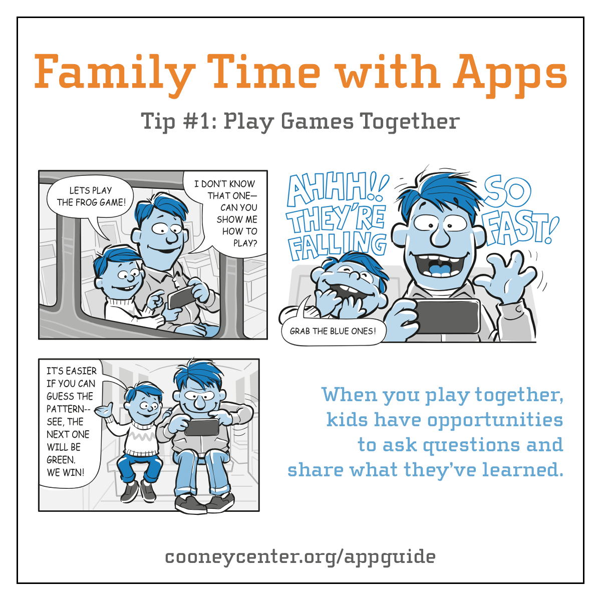
So is there no hope for apps? Well, as we looked closer, we saw that the kind of app the child chose to use made a big difference. If the app demanded continual interaction (think runner games or games with lots of special effects), children would let the app direct their attention and interrupt their interactions with their parent. But apps that followed the child’s pace (think drawing apps, or exploratory games where the player wanders in an open-ended world) allowed the child take control of their own attention. When children played with these kinds of apps, they would explain what was happening on screen to their parent, respond to their parent’s questions, and invite the parent to share the experience.
Most of the apps children played with were designed for one person to the use the tablet alone in a single orientation. And in these cases, children hunched over the device in a solitary position, often making it impossible for the parent to play too or even see what was happening. But occasionally, children played tablet games that were symmetrical and could be used by multiple people from all sides of the device. In these moments, the way children oriented to the tablet suddenly changed. They set it out on the floor in front them, in a way that invited the parent to participate. This orientation was exactly how families interacted with traditional toys: they spread out Legos, crayons, puzzle pieces, and board games in a shared space between them that made it easy for them to engage in joint attention and collaborative play.
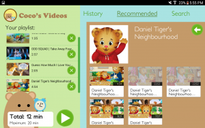

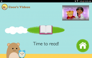
In another study, we evaluated different versions of a video player app for tablets. Children could use it to construct a playlist of YouTube videos to watch, and some of the time, the app would auto-play additional videos when the child’s planned playlist ended. Some of the time, the playlist would end on schedule. When the playlist ended as expected, children regularly took charge of putting the tablet away, often announcing to their parents that they were done and describing what they were going to do next,even though they knew they could opt to watch more videos, if they wanted to. When the playlist ended and new videos immediately started auto-playing, children’s responses were quite different. They hung around and watched more content, they were less likely to turn off the device on their own, less likely to talk about what they were going to do next, and more likely to need a parent to intervene. The content and the options available to kids were the same, but with the auto-play mechanic designed into the experience, children’s behavior was notably different.
Apps can provide children and their families with experiences that are both enjoyable and valuable, but many of today’s commercially available apps for preschoolers come with downsides. They hijack children’s attention, undermine their autonomy and self-regulation, and interrupt interpersonal interactions. But it is just as clear that it doesn’t have to be this way. Designers have the power to create experiences that respect children’s attention and autonomy, and support families in integrating digital media into daily life on their own terms. Apps that support multiple players and are accessible from all sides are more conducive to shared and collaborative play. Apps that can be interrupted and let the user control the action are more conducive to dialog and interpersonal engagement. Apps that provide natural stopping points and transition support make it easier for children to self-regulate their media use, while apps that forever auto-play more content make it harder. Designers of children’s media should hold themselves to a high standard and create play experiences that enhance daily life without insisting that they dominate it. And parents should demand this kind of quality and vote with their dollar.
 Alexis Hiniker is an Assistant Professor of Human-Computer Interaction at the University of Washington Information School. She studies the ways that technologies manipulate and exploit their users and how to design more respectful alternatives, particularly for children under 5. Her past and current work has been supported by Mozilla, Sesame Workshop, Microsoft Research, Facebook, and more. Her scholarship has been covered by The New York Times, TIME Magazine, The Wall Street Journal, NPR, Good Morning America, and many other media outlets. She holds a bachelor’s degree in computer science from Harvard, a master’s degree in Learning, Design, and Technology from Stanford, and a PhD in Human Centered Design and Engineering from the University of Washington.

